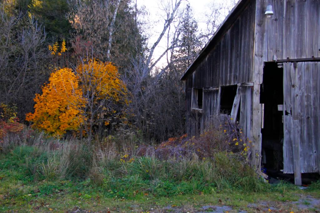
 Au naturel...
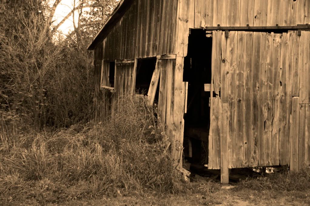
 sepia...
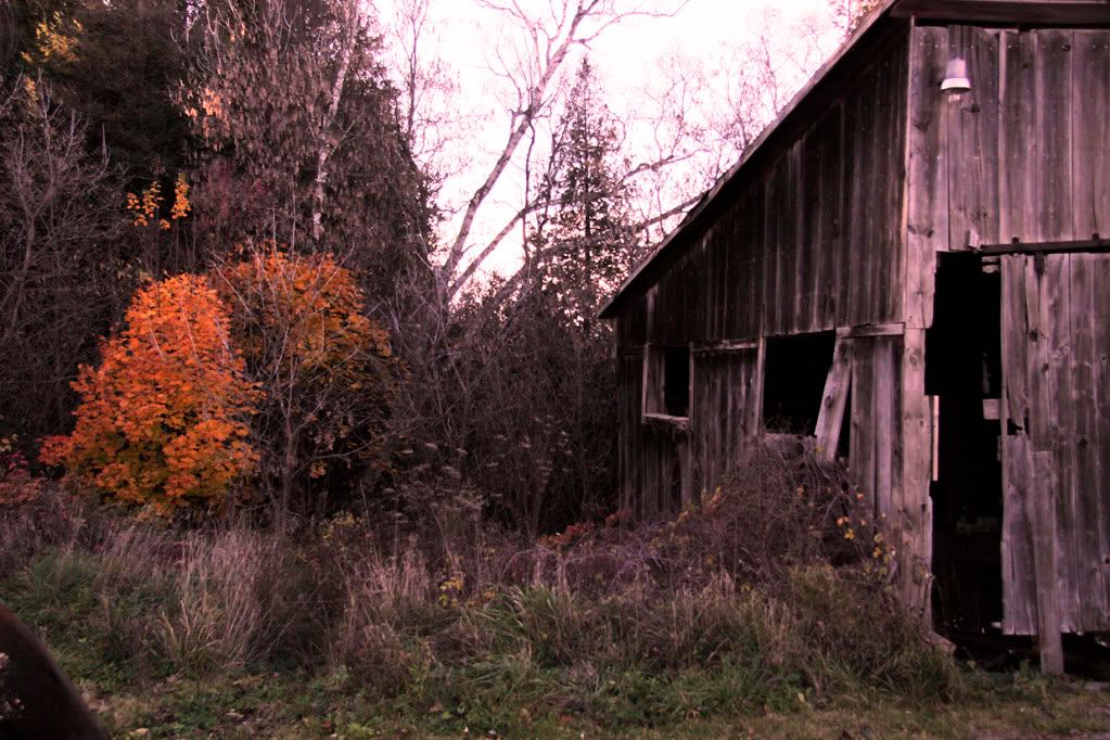
 and with a red filter.
Which do you prefer?
And now, without further delay, here are the Posts of the week. The icon below is yours for the taking if if your blog post is named as a Post of the Week - either as top post or as a runner up.
Other wonderful posts are categorized below (they may well fit into more than one category but I'm only selecting one for each):
Because Some Things Are Too Good Not to Share
by Reasons
at Reasons to be Cheerful
When Good Women Get Pissy
by Fragrant Liar
at Fragrant Liar
Roots
by Frank
at Baron it All
Horseback Riding Lesson 101
by Jane
at Gaston Studio
Autumn is Hanging Tough
by Scott
at Finding Another View
Gingko Leaves
by Sarah
at Plastic Acid
1954
by Betty
at Bossy Betty
The Divine Mrs. Kimball
by Kathleen
at Easy for Me to Say
Love and Death
by Gary
at Gary's Third Pottery Blog
Stands Knee-high to Little
by Alane
at Land of Shimp
Please drop by their blogs for a visit and leave a kind comment if you have the time. Also, please feel free to add your own choices (for any blog except this one) for a specific blog post in the comments section below, where others can see them.
Thank you.

56 comments:
Congrats all!
Aloha from Waikiki :)
Comfort Spiral
><}}(°>
<°)}}><
Heeeeeyyyyy! Thanks, Hillary! I am honored to be included with your Posts of the Week, and glad you got a good laugh out of it.
I think I love the red filter one. Beautiful!
I'm always a sucker for sepia. I'm also a sucker for old decrepit buildings so it's all good!
The Au Natural appeals to me! As a kid, I loved sneaking my parents camera away to photograph abandoned service stations!
The natural one - definitely my favorite.
Congrats to POTW - can't wait to stop by and read these excellent choices. Thanks.
I prefered your first photo Hilary. Old decrepid buildings fascinate me and can make interesting photos. - Dave
I love these images! They are beautiful, each and single one, in a different way...
Congratulations to everyone mentioned here.;)
xoxo
Very difficult choice, but I think I like the red filter. The building itself begs for sepia, but then the brilliant color in the little bush doesn't show, and it's such an important counterpoint to the abandoned barn. Yes, the red filter is a good compromise.
Congratulations to all!
I like the red filter one the best. Though they are all fabulous!
Hugs
SueAnn
The middle one draws the attention to the gaping black hole of the partly open door, so it DARES you to enter! Creepy! It gets my vote. :)
I like the first photo :D
nice. i love old barns and the worn wood look....and some great choices...many i have not read yet...jane's horseback is a hoot...
ME! Hey, thanks Hilary :)
Very atmospheric shots! Some good familiar names up here, looking forward to visiting with them.
I'm so into abandoned barns and are now doing a series of small paintings from some in rural Georgia... so I love these photos, especially the sepia tone one.
Thank you so much Hilary, for naming me with a mention in your POTW! Am off to read the ones I haven't been to already.
Jane
I normally prefer natural, but you make it difficult to choose... and the red filter wins out today.
Congratulations to the winners! I've already read Cricket's wonderful post (very deserving of the award) and Gary's post yesterday was amazing.
These photos prove that when someone says "everytime I look at it I see something different". I loved these and they would look beautiful on a stretched canvas and hanging in a hall way...I can see it.
Congrats to all the winners and I'm headed on over!!!
hugs
Sandi
I love the mystery that sepia creates. Also love the idea of the feral barn cats! I once saw a barn just like that and wrote a story about the cats inside! :) Thanks for posting.
http://onemagicalmomentperday.blogspot.com/2010/03/magical-moment-33-four-cats-and.html
I'm back Hilary, and I've just finished them all. WOW what a collection of great posts, Thanks so much for sharing them
hugs
Sandi
Great photos, it was difficult to choose but in the end Au Naturel is my fave.
Great POTW choices this week! Only glanced at a few, but I'll be back later!
I think wood always looks good in Sepia. But I like the first/natural one a lot too!
hands down, no contest.,.......the first one. love natural light........so gawjusss! What a lovely gift your blog is.
Thank you.
Congrats to everyone. I like the barn au naturel with the red filter a close second.
Au natural ..
The first two photos are my faves. I kept looking for the cat and her kittens until I went back and read the paragraph again...lol.
Love that title "When Good Women Get Pissy!"
I think the red-filtered shot is pretty cool.
Thanks for the tip of the toque. :)
Thanks for bookmarking me.
I do like the tighter cropped sepia version. I've taken to cropping things ever tighter, and perhaps I would trim that one even more on the left. LOL
Delightful.
I just finished my blog reading and was going to make lunch and then I come to your POTW...do you consider yourself an enabler? I like the fall color of the first...but I am trying to get more sophisticated in my tastes with monochromatic looks.
I love the original colors. As lovely as it is to play with filters, no one does it quite like nature itself.
Like them all but the sepia one has the old feel to it. Its the perfect match for the abandoned barn.
I always like coming here and seeing the world through your eyes.
Beautiful.
Sigh...finally!!! I tried to visit you here last night,Hilary, but for some reason couldn't get your page to load!! But hip, hip hooray!! I could today!!! :-)) Your photos are FABULOUS!!! I love the sepia Barn and the use of the red filter!!! WOW!!! These inspire me!!! I'm gonna walk...no run to my studio!!! :-)) Just had to come by to say hello to one of my favorite photographers and friends! Sending love, Janine XO
Well, thank you, Hilary. I appreciate your kind words and, even more, the possibility that the TCF cause will spread. My schedule is way off today. Usually I do this stuff in the a.m. Ugh.
I don't care for busy, myself.
I see several familiar and well-chosen posts here, and more I will explore when I can actually read and enjoy them.
Thanks again to you and congratulations to everyone else.
while the sepia is intriguing...I like the original, first shot the best. The blast of tree color against the blue-gray barn is exquisite.
Congrats to all as well.....and I love the red filter one cuz it makes those leaves pop!
Always a pleasure to read the posts featured here - all of them - but Cricket's is, indeed, a rare treasure.
You got it just right again, Hllary, though how you do it remains a mystery. I find it hard just to read my few followers and your potw's of course, never mind find time to write post. You are a marvel.
Oh...the sepia one everytime.
I prefer the top one in this case, because of the contrast of the color of the leaves in the tree and the perfect gray wood in the old barn/shed and who doesn't love an old barn/shed. I've posted a few myself lately with more to come.
I am smitten that you liked my post well enough to name it among your POTW. Thanks
Congrats to all the winners. I'll check them out.
I like the first one, mainly because of the burst of yellow. The second one looks kind'a spooky to me. :P All abandoned....
Congratulations to everyone.
I loved that Thanksgiving story, Hilary.
i love the middle one....for some reason the orange tree in the other photos through me off.....
sheesh....what a goober i am....
how about "throws me off"
maybe this daylight savings really is getting to me....
It's hard to decide, but I think I like the first photo best. I love the golds of Fall.
Thanks for the fab POTWs. Cricket did an excellent job with her Thanksgiving Comes First post.
Hope all is well with you. Cheers, jj
Not sure if I like red or natural best. The sepia isn't working for me in this case.
======================================
I am now blogging over at The AC is On
They are all very nice. I like different ones for different reasons. The au natural shows the gorgeous yellow leaves, and it stands out so sharply against the bareness of other trees.
I like the sepia picture for how it seems to accent the old building. as a focal point. I get the feel of the building.
Great shots.
I like it best with the red filter. Great shots-and a great post!
Thanks, everyone for the kind comments and your always wonderful support shown to the POTW bloggers. You make it such a fun experience.
Sepia. And the Fragrant Liar - gotta love her.
The first one (I like the touch of orange from the tree).
Congratulations to the POTWs!!!
I have some great reading to catch up on--thanks, Hilary!
Here I come in late, my hair a mess, catsup on my shirt to say thanks for a POTW mention!! So sorry it's taken me this log to get here to show my appreciation. Is it time for an attendant of some kind? I think it might me. So honored to be with these other fine folks! Thank you!
For the barn picture I prefer the sepia. Great picture. Something about old barns, huh. Yay for Cricket. I read this and it moved me greatly.
Truly great picks this week, congrats to all the POTW blogs.
I think the red filter pic has the edge. It underscores the difference between the life of tree and the dilapidation of the barn and somehow, it's just lonelier.
Lovely photos : )
And THANKS!!! :D
I spent over 3 hours going through some wonderful posts and joined one. It was fun to get the feel of some new ideas and blogs to try.I am sure I may join a few others down the road.
I like Au Naturel! Mainly because it's greener than the other ones! That's a very cool barn!
:)
Post a Comment